The Power of Typography in Web Design: Enhancing Readability and Aesthetic Appeal
The Importance of Typography in Web Design
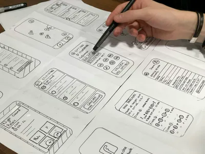
Typography is a fundamental element in web design that goes beyond mere aesthetics. It plays a critical role in readability, user engagement, and the overall user experience. Effective use of typography can significantly improve how visitors interact with your content, making it an essential consideration for business websites.
Enhancing Readability
Choosing the Right Fonts
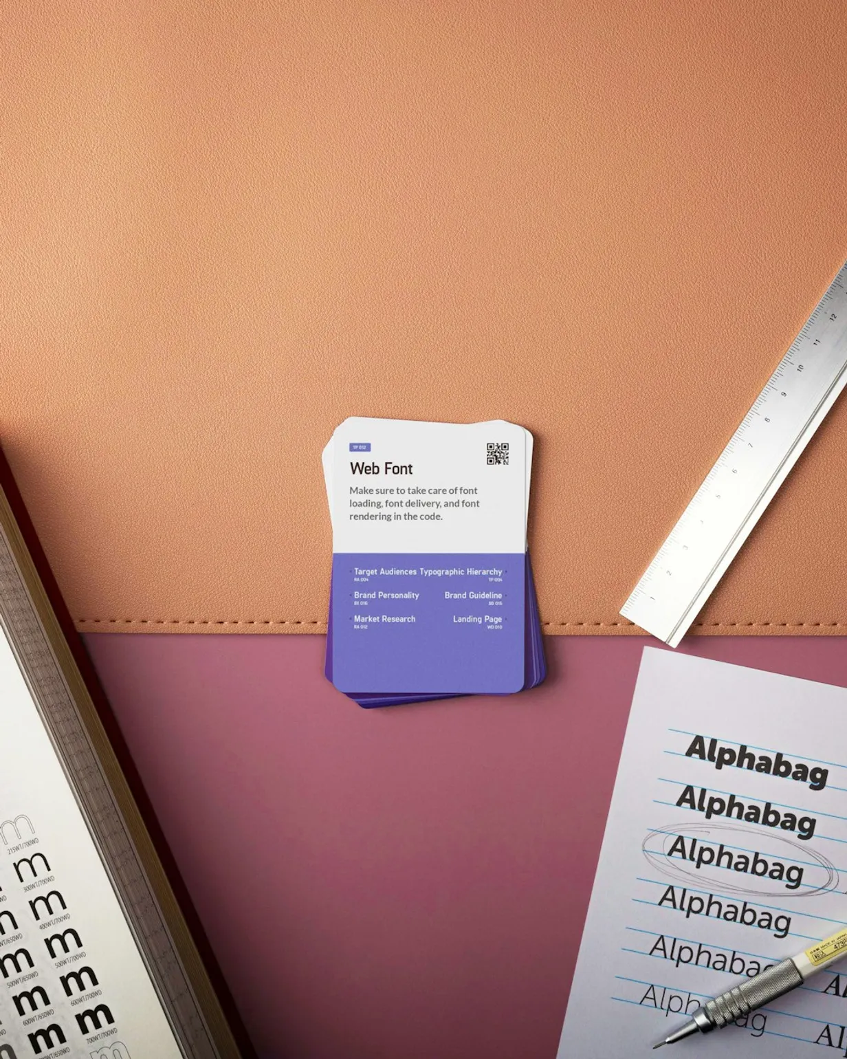
Selecting appropriate fonts is crucial for readability. Sans-serif fonts like Arial, Helvetica, and Verdana are commonly used for their clean and modern appearance, making them easier to read on screens. Combining different fonts can also create visual hierarchy, guiding users through your content more effectively.
Font Size and Line Height
Font size and line height are critical for readability. Larger font sizes and ample line spacing reduce eye strain and make it easier for users to follow along. The general rule of thumb is to ensure your body text is at least 16px, with a line height of 1.5 times the font size.
Creating Visual Hierarchy
Typography helps establish a visual hierarchy, which is essential for guiding users through your content in a structured manner. Headings, subheadings, and body text should be distinct in size, weight, and style. This differentiation helps users quickly scan the page and find the information they need.
Consistent Styling
Consistency in typography styling is important for maintaining a professional look. Stick to a limited number of fonts and styles to avoid a cluttered appearance. Consistent use of font sizes, weights, and colors across your site contributes to a cohesive and polished design.
Setting the Tone and Brand Identity
Reflecting Your Brand
Typography can convey the tone and personality of your brand. For instance, a playful and creative brand might use handwritten or script fonts, while a corporate brand might opt for clean and straightforward sans-serif fonts. Choose typefaces that align with your brand's voice and message.
Emotion through Typography
Different typefaces evoke different emotions. Serif fonts often convey tradition and reliability, while sans-serif fonts suggest modernity and simplicity. Be mindful of the emotional impact your font choices may have on your audience, as this can influence their perception of your brand.
Conclusion
Typography is more than just choosing fonts. It's an essential aspect of web design that can enhance readability, establish visual hierarchy, and reinforce your brand identity. By thoughtfully selecting and applying typography principles, you can create a more engaging and effective website for your business.
Related Articles
Discover articles tailored to your interests, providing deeper insights and extended learning opportunities. Our "Related Articles" feature connects you with content that complements your current read, ensuring you have all the knowledge you need to make informed decisions about your business's online presence.